The client wanted AR-driven sales growth but lacked the backend to store, process, and integrate 3D models into their app.
Tintash delivered a seamless AR module, enabling real-time product visualization by integrating 3D asset management with the client's e-commerce system.
Within the first week of launch, over 300 AR-enabled products were sold, driving a 30% year-over-year increase in sales for AR-integrated items.
This client, a US-based Fortune 500 corporation, was looking to follow its competitors into becoming one of the first few companies to enter the realm of augmented reality. They engaged Tintash to build an AR module for their mobile app that would allow a personalized shopping experience to their users by enabling them to visualize products in their own environment.
The client also wanted a solution to store, process, and provide 3D product models to their mobile app for visualization. This online portal would offer artists the facility to upload, verify, and edit their 3D models based on our model rendering and conversion pipeline.
Our team was tasked with building the whole module from scratch. While the client’s US-based team of 3D artists created product models, our job was to take those virtual inventories, ensure production quality standards were met, and visualize them in AR. Our designers would create intuitive experiences which our engineers would then translate into features to engage users in the AR module.
Tintash team worked in an iterative manner to deliver the following components that powered the entire AR module:
- In-app AR viewer: The AR viewer feature was the interface for users to interact with 3D assets in their own environment. The AR viewer came with embedded options to switch product sizes and colors. The interface also had the shopping cart integrated for a seamless purchasing experience.
- 3D asset management portal: A 3D asset processing, storage, and distribution platform integrated with the in-app AR module. The portal provided an interface for 3D artists to upload assets. The assets would then go through a quality evaluation pipeline which identified the improvements needed to make assets production-ready for the application. After passing quality checks, production-ready assets were then integrated into the application.
We began the process with a brief study of existing AR solutions. We also conducted user interviews of the current product. By building a sense of user personas and the overall landscape of the market, we worked alongside the project stakeholders to better strategize features and strengthen the brand’s positioning in the market.
Our UX designers explored many AR applications and documented their product flows in detail. We used the competitor analysis to get feedback and approval of the client’s executive team before commencing the design and development phase.
As a starting point of our efforts, our team built a visual representation of how the app module would function and behave. The idea served as the foundation for technical analysis to build out a plan of execution.
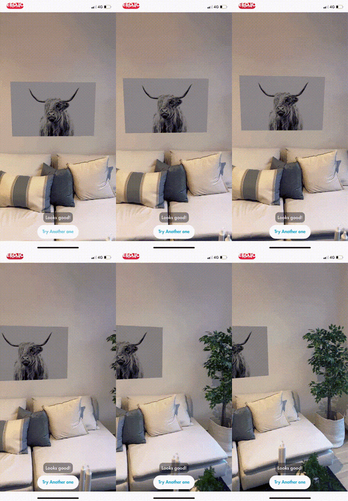
Our work on the product was divided into two different feature phases. The first phase of development was focused on setting up a foundation of the AR module through the visualization of floor items. The second phase of development was focused on innovation to visualize wall items and curtains on windows, something that had not been done with finesse at that point in the AR space. Both approaches followed different timelines and posed a distinct set of challenges.
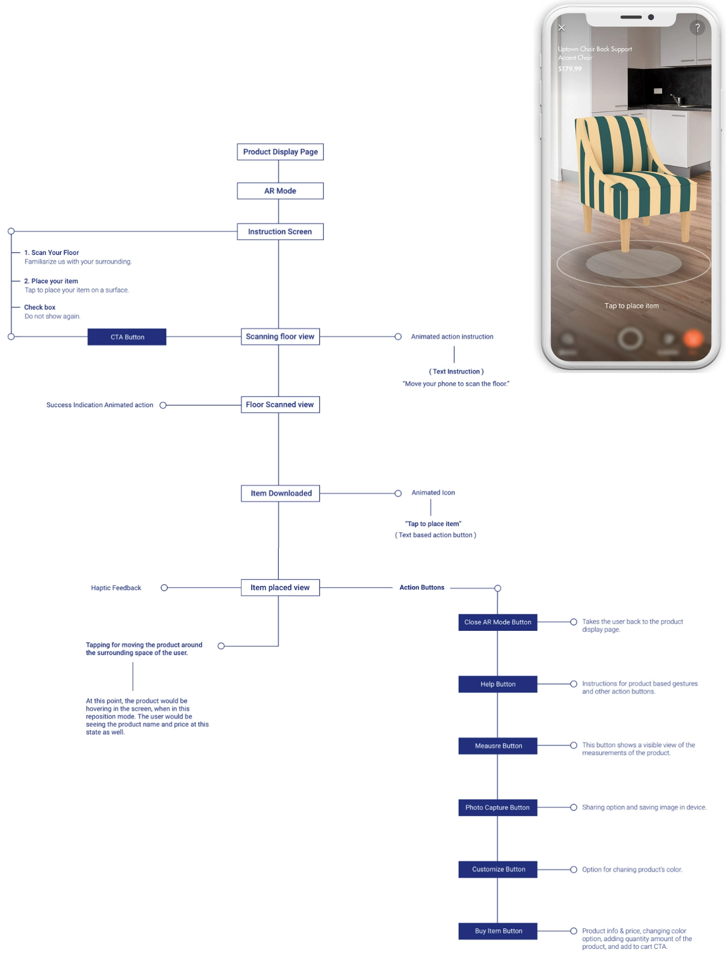
Following this, we worked on the execution concept. Some of the new features we explored at this stage included haptic feedback (vibrations), sound effects, animations of icons and items, guiding messages, and a hovering feature for product information and repositioning. We also included an out-of-bounds scenario as well as offset indicators for finding lost items in the environment.

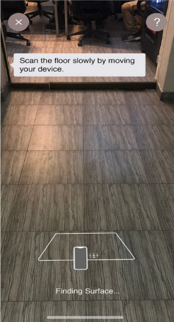

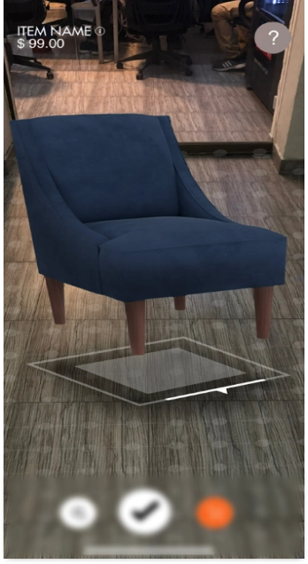

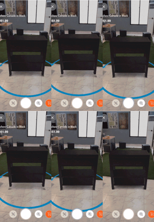
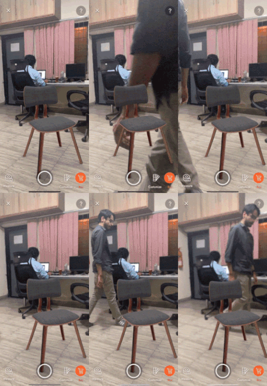
We next embarked on the build testing phase with these first iteration designs. Although the visual designs were not very sophisticated at this point, our main objective during these sprints was to develop the AR mode such that it was in an eligible format for testing in real-time.
After translating our visual design concept into a developed version, we iterated to improve the user interface while also exploring ways to better communicate our product’s journey flow – from point A to point B – to the users. The designs below represent the final version of this first phase of floor items. This time, these were made with a properly defined design file, including assets such as icons, 3D rendered images, text styles, colors, and buttons.
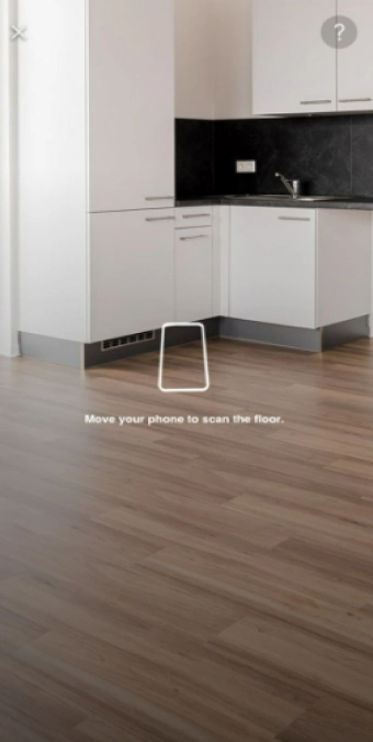
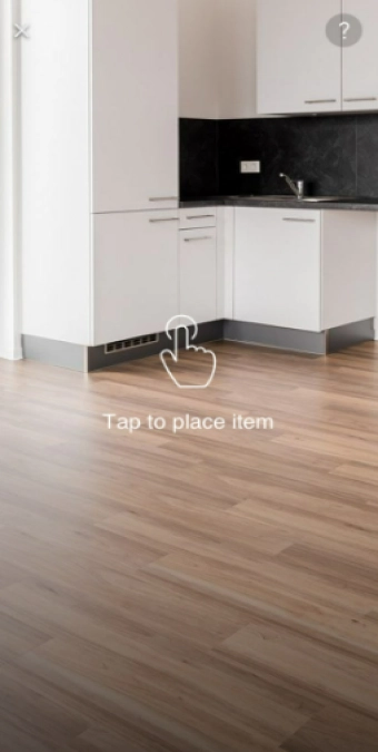

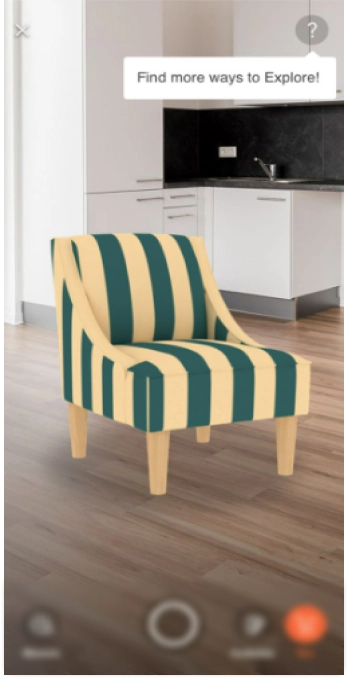
Once these designs were translated by our developers, the build was shared with the client for their final approval before being made live.
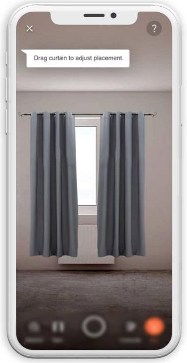
During this phase which lasted four months, we mainly focused on exploring how to place curtains over a window. The concept had been attempted before in an experimental capacity but the challenge was to implement it in AR with finesse.
The curtain viewer feature would have offered the client a huge edge over its competitors’ offerings, however, accomplishing this feat posed some challenges:
- The biggest technical challenge was to detect a window, identify the placement area of the asset and adjust the asset size dynamically to fit the window. There were no off-the-shelf components available in the industry to leverage and use as a baseline of development.
- Since window sizes on a user’s end were a variable, our curtain 3D assets had to be designed in a way that would allow them to fit on a user’s window dynamically. This would add the visual finesse in the experience and would provide users a more accurate representation of how the curtain would look like on their window. This required an innovative approach to 3D modeling of the assets.
We started by studying competitor apps to analyze their experience flows for wall items. While we found some apps that catered to the general wall items such as paintings, in most cases, the apps would either collapse or their product quality was low. However, there was no app available that catered to curtains.
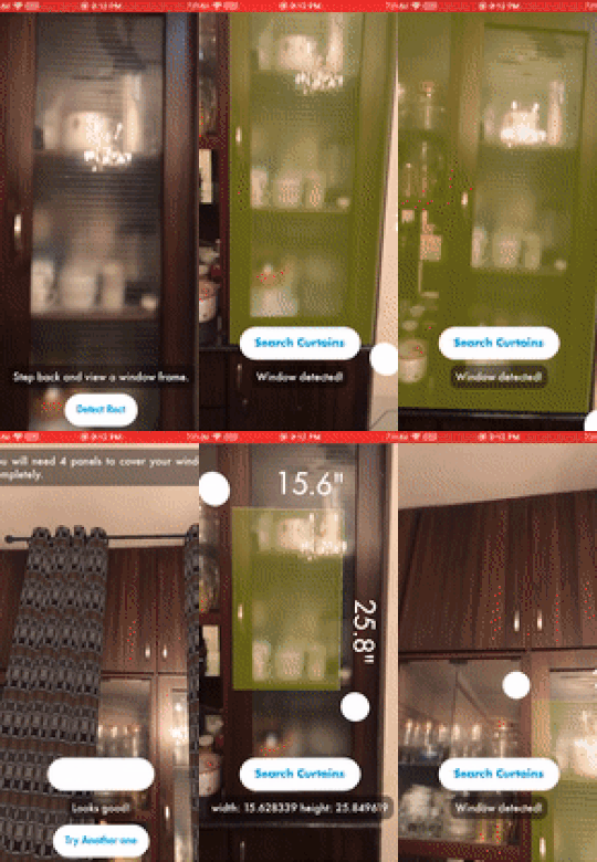
As with floor items in the first phase, we created a system pipeline to map our users’ journey. Our engineers divided the solution into two prototyping phases. The first phase focused on using computer vision to detect a window through the visual feed of the camera. The second phase of prototyping focused on placing a curtain 3D model over the detected area.
During the front and back-end development phase, we conducted a lot of experiments to improve our results. While testing our build, we worked on improving the app’s detection ability so that it was able to capture the exact detection point. We also added curtain animations (to open and close them) and SKU switching options.
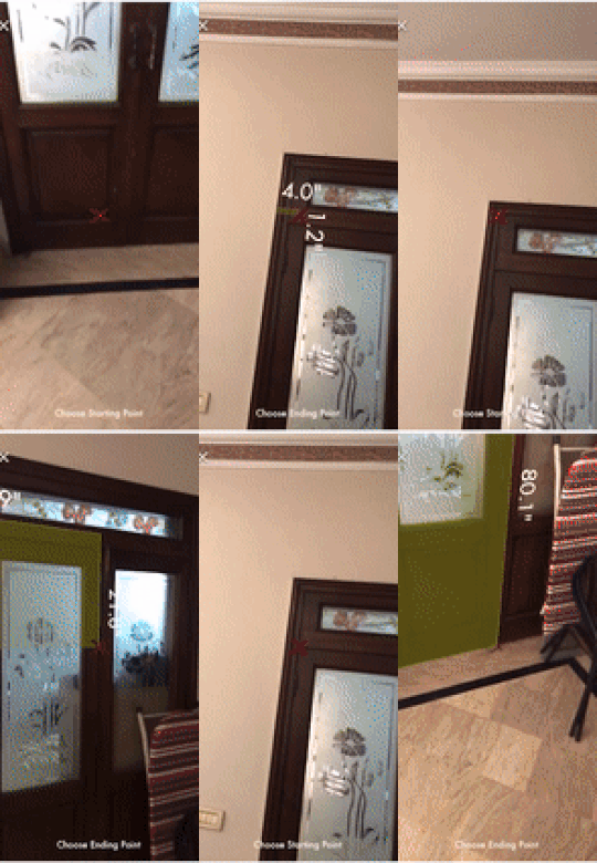
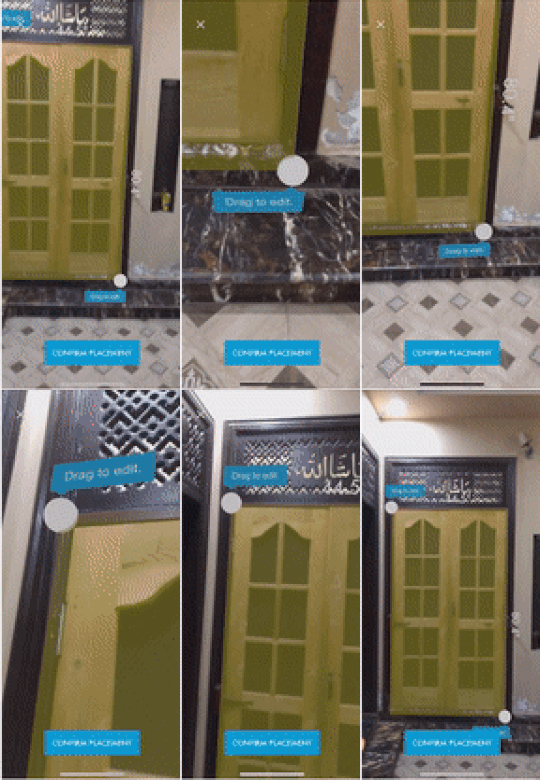

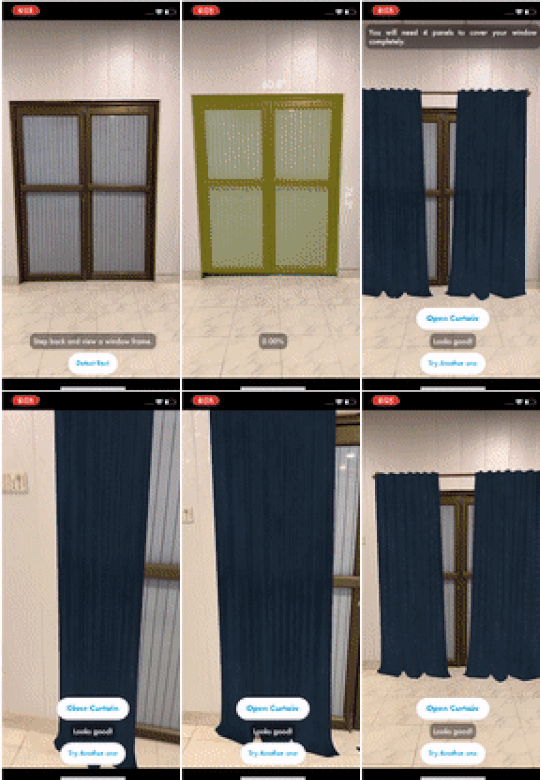
In the final sprint, we made some changes based on user feedback such as introducing a feature to adjust the window and curtain placement area manually, on top of the algorithm-assisted initial window detection. We also worked on polishing the UI and included action oriented steps to allow for easier navigation through the application.
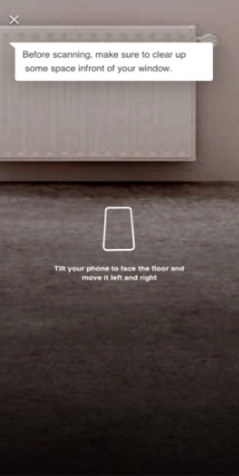
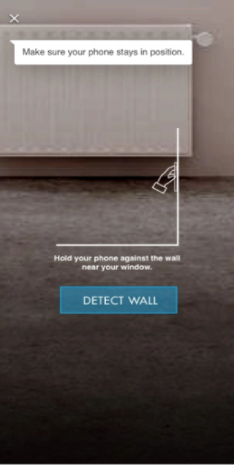
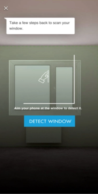

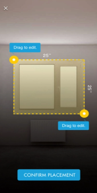
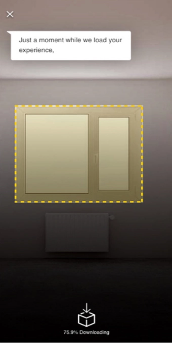
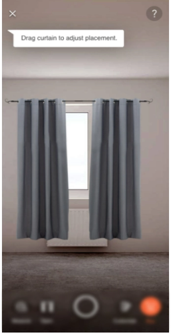
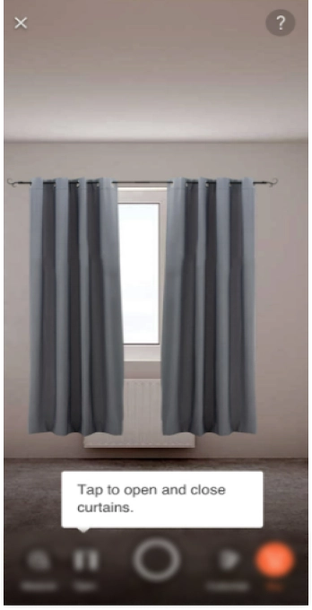
After this final iteration, the designs went into the development phase to be translated. The build was shared with the client who received it very well and gave the approval for making it live.
During the course of this project spread over two phases and lasting multiple years, we implemented AR visualizations for domestic merchandise such furniture, appliances, as well as wall items like mirrors, paintings, and curtains. In this short timeline, the team successfully delivered a product matching the design and experiences of competitor offerings while also pioneering the curtain feature in the AR domain.
We also created an online portal for the client’s artists to continually expand the module’s virtual inventories using our dedicated 3D model preparation, conversion and rendering pipeline. The portal uses extremely light 3D models to keep downloading time minimal and app memory in check while at the same time retaining a high texture quality.
Since augmented reality is an emerging field, the client wanted a partner that could constantly innovate and push the boundaries of this technology. Tintash delivered just that. Our pioneering work on the curtain development feature is an apt example. Despite the industry lacking any precedent, our team was able to successfully deliver a feature demo within one week.
Tintash has proven to be a reliable and committed development partner. They strive to deliver high-quality work on time. They are detail-oriented and make a concerted effort to integrate with existing teams. Tintash’s technical skill set is impressive, but their loyalty is most commendable.
The goal of offering AR visualization of products was to boost customer engagement and sales conversion. Once the build went live after phase 1, it successfully converted 2000 daily users on average in the first two weeks. In phase 2, we observed over 200 users who made purchases using the AR experience in the first five days.
Although small, this conversion rate was significant for two reasons. First, this user influx was organic since the client had not yet started promoting the AR feature via focused marketing. Users who were engaging with this AR feature only discovered it either in the product display page or through the AR icon placed beside the product image. Secondly, only a small proportion of inventories were erstwhile available in the AR mode.
As augmented reality makes rapid inroads in every industry and transforms consumer behavior, it has become imperative for leading businesses to embrace immersive technology solutions to remain competitive down the years. The module we developed ideally positioned this Fortune 500 company to capture gains of the AR revolution.
